How to Write a Clear and Persuasive Email CTA

Contents
What makes a great email CTA?
Unlike a Call to Action on a website, landing page, or social media, email CTAs have their own specific challenges.
Unfortunately, email marketing today has become incredibly saturated, making people less likely to read your message and click for more. The average email click through rate for a company of more than 50 employees is just 2.75%, according to a benchmarking report from MailChimp.
With numbers like that, it’s clear that it takes real effort to create a marketing CTA that actually converts. If you want to stand out, surprise, and delight your readers, you better have concise and compelling copy to convince them it’s worth their click.
There are many different ways to approach writing a persuasive email CTA, but no two businesses are alike. What works well as a CTA for one company won’t work at all for another. As always, you have to test, tweak, and re-test every tactic you try.
So while you shouldn’t exactly copy another company’s excellent email CTAs, you can be inspired to try something new in your own email marketing. Here are 5 powerful examples of ways to think about your email CTAs, from sales offers to upgrades to onboarding flows.
By emulating these ideas, hopefully you’ll feel inspired to improve your own email CTAs and start to drive impressive click through rates that fuel your business.
Dropbox: Upgrade from Free to Paid
For many businesses that operate on a free-to-paid model, the upgrade email CTA is especially difficult to get right. How do you convince a customer who is using your product completely free of charge to see the value in upgrading to the paid service? How can you make them click and convert on a CTA? It can be a daunting task.
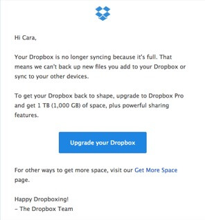
This email from Dropbox is a classic and simple version of the upgrade email CTA. Here, Dropbox offers you the facts: your Dropbox isn’t syncing because the free version has a limited amount of space. If you want to keep using Dropbox seamlessly, you have to upgrade to the paid version.
That alone might not convince everyone, but they offer a few more incentives. The paid version offers you a ton of space — 1,000 GB to be exact, as well as other features you can’t access now. It’s tempting and tantalizing to just click on the button and upgrade your Dropbox immediately.
However, this is not the only CTA in the email. In addition to the main button CTA, they also include a bit more information for users who are looking for other options on how to get more space. Dropbox knows that the upgrade CTA may not grab everyone, and they have to offer more detail to convince a few skeptical readers. This email, while just three paragraphs long, packs a punch and helps Dropbox drive clicks and upgrades for every account that runs out of space.
Sumo: One Last Chance
What happens when a new customer signals interest in your product, but then never actually takes action to install it or use it? That’s when you need a solid activation email with a CTA that provokes an immediate response.
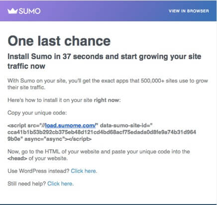
Sumo faces a unique challenge with this email: they’re asking the reader to copy HTML and paste it into their website’s code. Depending on how technically savvy the recipient is, this could be easy, or hard. That’s why the CTAs within this email are so vital.
First, they emphasize how easy it is to install Sumo — it takes just 37 seconds! Then, they offer social proof of the value, sharing that 500,000 sites already use this exact product to grow traffic.
Then, comes the hard part. The actual CTA here is to copy and paste the code. However, they also offer two other CTAs for people who use WordPress or for someone who is still confused by the instructions above. A simple “Click here” acts as a CTA for anyone who needs a bit more instruction in how to use Sumo. These three CTAs are each simple, effective, and guide the user to the desired outcome — installing Sumo on their site. If you think your product, like Sumo, can be tough to get users to install correctly, just remember that there’s always a way to write around it.
SquareSpace: Onboarding New Users
This is a familiar type of CTA for most B2B businesses. A new customer signs up for your service or buys your product — now what?
Many businesses send out an email that guides new customers through a process of setting up their account, changing their password, activating various features and hopefully experiencing the full value of the product. The danger for this type of email CTA is that it can quickly can become cluttered and confusing, causing your click through rate to drop and a new customer to become unengaged.
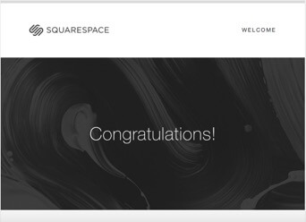
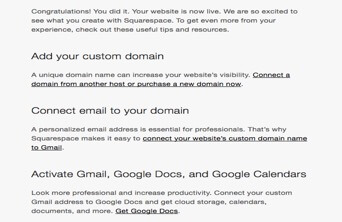
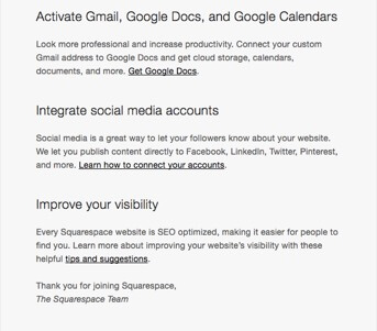
This email from SquareSpace is a great example because it covers LOT of ground, but is still fairly short and to the point, saving busy readers a lot of time. When you have multiple CTAs like this, it’s all too easy for the reader become overwhelmed and confused, not knowing where to click or what they should do next.
This example is powerful because it is clear and concise. Each of the 5 separate CTAs are bold and underlined, making sure there’s no confusion about where to click or what the reader is getting when they do. Unlike a button CTA, this type of text-based CTA can often convey a bit more information to a recipient.
Even someone who skims this email and doesn’t read every section fully will understand they can buy or connect a domain, connect to Gmail, get Google docs, connect accounts, and get other tips and suggestions. This simple user onboarding email achieves a lot with a few strong CTAs, and you should always keep that in mind when writing your own.
Rent the Runway: Shop Now
This type of email CTA should be familiar to anyone in e-commerce, or really, anyone with an email address. Most sale promotions you’ve seen before probably have a button CTA trying to get you to “SHOP NOW!” However, very few brands effectively and subtly create a sense of urgency with the copy leading up to that standard CTA.
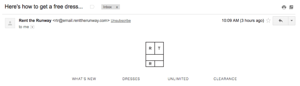

This email from Rent the Runway is highly effective because it helpfully fills in the blanks for recipients and proves why you should shop now. The offer is clear: if you rent one dress, you’ll get two free. But Rent the Runway realized that the offer brings up an immediate question for the recipient: what events would I wear those two free dresses to?
Rather than making the reader work to figure that out, Rent the Runway fills in the blanks with a fun and useful gif suggesting occasions for every dress. This is an irresistible offer for anyone who has used Rent the Runway before, and it creates urgency with a subtle deadline of March 19 along with a custom code.
Then, you get to the simple and clear CTA button that says “Shop Now.” While the CTA itself isn’t complicated or original, the difference here is the compelling copy that leads up to the it, enforcing the urgency and value of the offer. The reader knows exactly what they’re getting and why when they click “Shop Now.” If you’re in e-commerce, this should also be your goal with any type of sale CTA.
Calendly: Keep It Simple
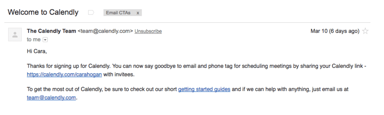
Great CTAs aren’t always reliant on fancy graphics and gifs — sometimes a simple text email is all it takes to dramatically up your click through rate.
In this example, Calendly’s new user email is as simple as the product they offer. There are technically 3 CTAs in this email, but it’s just 4 lines long with zero special formatting. The simplicity of the text-only email and the simple URL CTAs make it crystal clear what you’re getting when you click.
Reading this email, you immediately understand how to start using the product and where to go if you have any questions. It’s short, sweet and to the point, which is always a plus for the busy recipients. This type of CTA great option to test out for your business, especially if you have limited time and few design resources.
If there is any running theme within all of these great examples of email CTAs, it’s this: be simple, clear and concise in your copywriting. Just because you have a lot to say, doesn’t mean you need a lot of words to express your ideas.
By showing value, offering social proof, and including clear instructions, your email CTAs can actually convince people it’s worth a click.

Continue reading


Social
![]()
![]()
![]()