The Anatomy Of A Perfect Lead Generation Form: A Guide For SaaS Businesses
Contents
In order for a SaaS company to thrive in a highly competitive industry, it is important that they are not only retaining their current customers, but generating new ones. It can be tricky to entice a prospect to choose your service over that of a competitor, and often this decision is not made immediately.
Lead generation forms are an excellent way of gathering a potential customer’s information in order to reach out to them at a later date and encourage them to try your service. However, not all forms are made equal, and it is possible to get it wrong and deter a prospect from signing up.
What Are Lead Generation Forms?
Lead generation forms are a key part of the lead generation process, helping to capture different information from potential customers. Some of the most widely used lead generation forms include:
- Contact forms
- Newsletter sign up forms
- Registration forms
These forms help gather a range of information including:
- Name
- Email address
- Phone number
- Address
- Age
Some forms may collect additional data, such as a date of birth or comments regarding how a business can improve their customer experience. This information can be used to help capture potential customers for businesses.
How To Measure The Success Of Lead Capture Forms
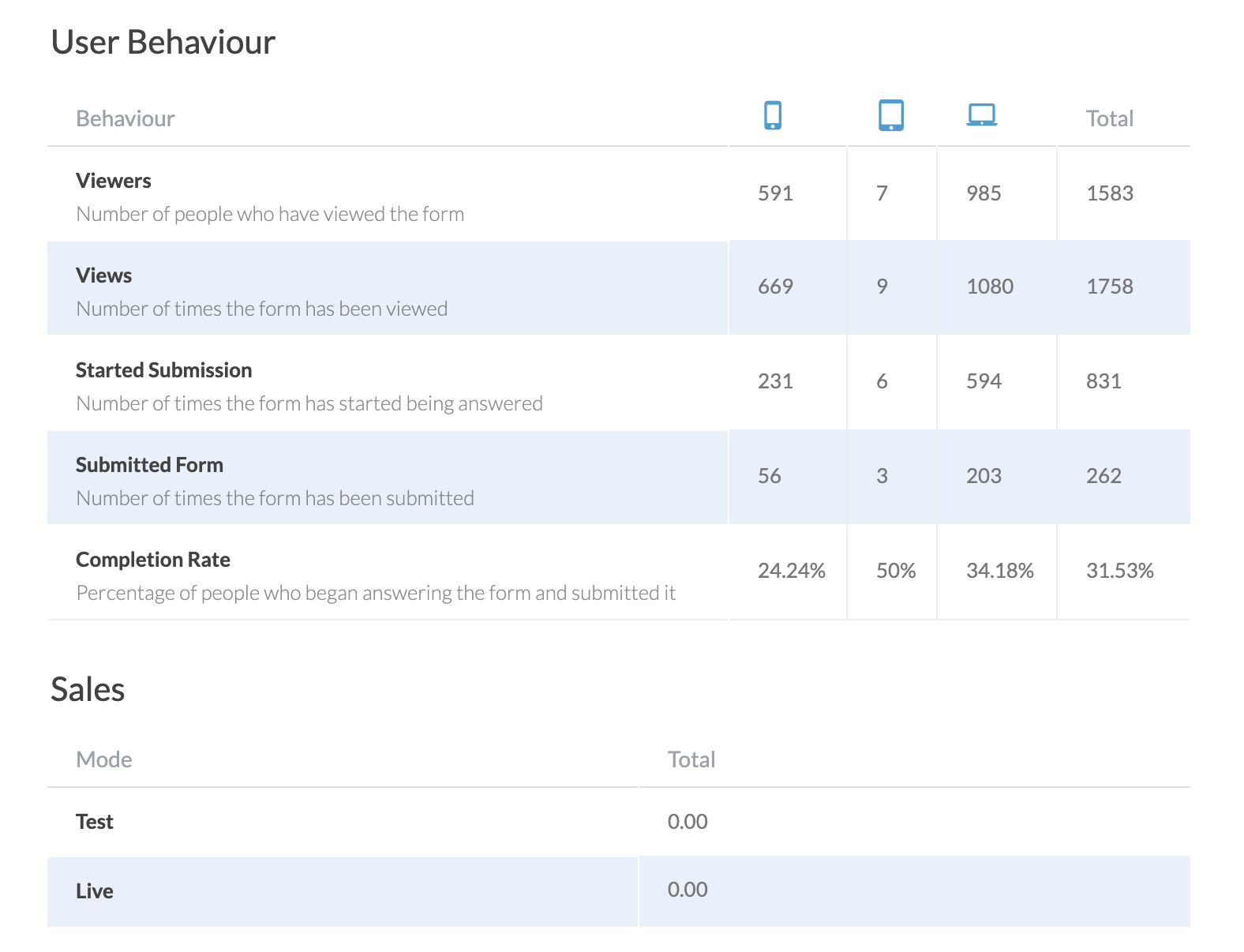
Lead generation forms are a great way to capture the information of potential customers, but what measures the success of a lead capture form?
Data is crucial for informing marketing activities, and while 80% of marketers say that they are driven by data, there are at least 1 in 3 teams that fail to adequately measure their lead generation success. Although analyzing how effective lead generation forms may seem like a minor detail, it allows businesses to make improvements and help with future planning through valuable insights.
Some of the key metrics that can be used to measure the success of a lead capture form include the following:
1. Conversion rate
Conversion rates are a great way of establishing how powerful a lead generation form is. The higher the conversion rate, the better the form is performing. Conversion rates outline how many potential customers completed an action, the action in question is dependent on what a particular form is hoping to achieve. However, some examples include:
- Making a purchase
- Signing up to a free trial of software
- Signing up to an email newsletter
2. Click-through rate (CTR)
A click-through rate relates to the number of clicks on a call to action or submission button. This can help measure the impact of its messaging. It is important to recognise that a CTR can only be measured in lead capture forms that include a link.
3. Cost per lead
Cost per lead can be another valuable metric to measure the performance of a lead generation campaign, by working out the number of leads acquired versus the cost of the campaign. Cost per lead can be an effective unit of measurement as to the ROI for a campaign, and is a valuable metric as part of an overall campaign evaluation.
Measuring the success of lead capture forms allows assessing which marketing channels produce the best results, and helping to make more informed decisions about future campaigns.
If a lead generation campaign is failing to deliver, then marketers should consider reaching out to their target audience to help establish what’s going wrong. It could be that the audience needs have been misunderstood, and a different approach is needed for future campaigns.
How To Build A Perfect Lead Generation Form
There are many steps that need to be taken to create the perfect lead generation form. Form templates can be a valuable tool, however, some thought is required as to how best to appeal to the target audience.It is important to consider how to choose the right questions and how to ensure the form is aesthetically pleasing to the target audience.
1. Research Your Audience
To create the perfect lead generation form, SaaS companies need to carefully study their target audience. Having a clear idea of who the form is for, and building a picture of what their interests and values are, can help create a form that’s more likely to appeal to them directly.
Alongside the main objectives, defining the audience will help create a form that’s fit for purpose, rather than following others in the same industry or choosing a more generic approach.
Some questions to consider when creating your forms include:
- How will respondents find the lead generation form? Will it be through social media? A newsletter or an online ad?
- Are respondents already familiar with the business being promoted?
- What is the incentive to get respondents to volunteer their information?
If multiple audiences are being targeted, creating different forms suitable for each TA could be an effective strategy to help secure better results.
2. Structure Forms Well
A typical form is easy to create, but creating a successful lead generation form requires a little more consideration. The structure of the form can make a big difference to how it is received, helping respondents to navigate the questions easily, without taking too much of their time.
The structure of the form should be easy to follow, and in a logical order for respondents to work through. It is recommended that questions flow easily into the next, otherwise there’s a risk that respondents will become confused and abandon the form part-way through.
The shorter the form is, the easier it will be for respondents to complete it. Email subscription forms, for example, have just one question to answer that can help attract a higher number of respondents.
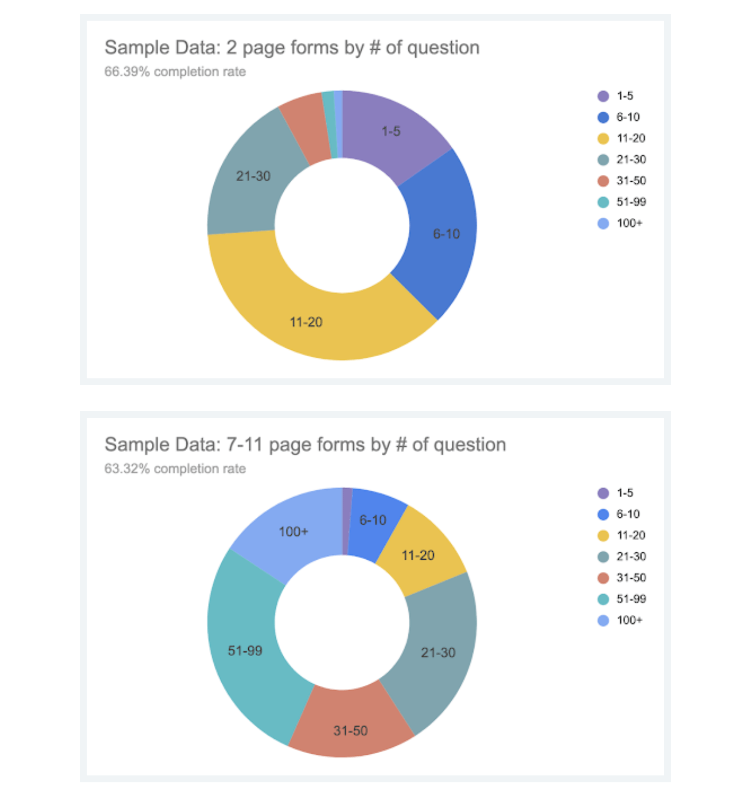
Our research at Paperform showed that single page forms performed significantly better than forms with multiple pages, returning a completion rate of approximately 15% higher than the multi-paged forms (2 pages and more).
3. Include The Right Questions (And The Right Number Of Questions!)
It’s important to include the right questions in a lead generation form. Forms that contain questions that appear too intrusive, or obscure, result in prospects abandoning the form. Asking basic, familiar questions can build trust with respondents, encouraging them to complete the form.
4. Keep It Short
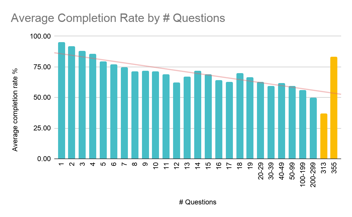
It’s no secret that people have short attention spans, especially when it comes to spending time online. Studies have shown that shorter forms perform better than longer ones. A Paperform analysis of 4,040 forms showed that adding a second page to a form reduced the completion rate by 15% (from 82% to 66%), with forms over two pages failing to achieve higher than a 65% completion rate.
Some of the ways to keep a lead generation form short include:
- Only ask the necessary questions. Avoid questions that won’t capture valuable information.
- Avoid asking too many in-depth questions at this initial stage. The form should be simple, allowing further questions to be asked during follow-up meetings and conversations.
- Consider the answers sought from respondents. This can help form the simplest way to ask them, including the appropriate input field.
5. Choose The Right Input Fields
When it comes to framing questions, it’s important to pick the right type of input field to match. This will help keep the form concise, limiting the amount of time a respondent needs to spend completing each field.
There are many ways to frame lead generation form questions, some input fields to consider include:
6. Single Line Text
Suitable for entering short lines of text. Ideal for collecting basic information such as names, email addresses and address information.
7. Paragraph Text
A longer input field for entering a paragraph of text. While longer-form questions can be off-putting to respondents, they could help gather more specific information about the respondent’s needs.
Paragraph style fields can be incredibly useful for SaaS companies as they allow customers and prospects to give feedback, which often creates a feeling of value within the person completing the form.
8. Dropdown
A dropdown menu containing predefined answers. Dropdown menus are incredibly effective as they require very little effort on the part of the respondent, however they still provide valuable information to the business.
9. Multiple Choice
Typically features a series of tick boxes that allow a respondent to choose from one or more predefined answers. Useful for gathering specific data, but as with a dropdown menu, there needs to be a full range of answers, and potentially an ‘Other, please specify’ option to allow respondents to provide further information where necessary.
10. Checkboxes
Checkboxes can provide a single answer to questions with multiple answers. Ideal for yes/no questions and for gaining consent for different marketing activities. Not particularly effective for questions where a wider range of answers are needed.
11. Number fields
Number-only fields can be used to capture information like phone numbers or date of birth. Although number fields don’t provide flexibility for other types of data, this is not their purpose. They are designed to be simple, quick and reduce friction.
12. Choose The Right Wording
Wording is one of the most important elements of a perfect lead generation form. Some tips to help SaaS companies find the right words include:
- Keep the tone friendly and positive – avoid pushy or aggressive language.
- Make sure the wording is clear and easy to understand. Use fewer words and short, snappy sentences to convey meaning. Sentences that are long and wordy could stop someone from making it to the end of the form.
- Avoid using jargon – people need to be able to read the form without scratching their heads.
- Sense-check the questions. They should be easy to read, with no ambiguity about their meaning.
- Remember to consider the audience when framing the questions. Adopting the right tone can help address an audience directly, reflecting what has been learned about them during the planning stage. Some forms call for simplicity, with easy-entry fields like ‘name’, ‘email address’, while a more conversational tone would use a ‘what is your name?’ approach to appeal to potential customers.
Testing the wording will help ensure the form is hitting the right note. Running a pilot can identify problems ahead of roll-out, ensuring it is perfect by the time it reaches the desired audience.
13. Make Forms Beautiful To Build Trust
The final step in crafting the perfect lead generation form is in the design.
Traditionally, forms were plain and boring, but those days have passed! The form, especially of a SaaS company, should be eye-catching and attractive. If businesses who are selling a software want to instill trust in their customers and build customer relationships, it is essential that all aspects of their website are perfect.
Creating forms that match the branding and overall style of the company and website is not only a great visual marketing tool, but will also ensure it catches the eye of prospects, and encourage them to complete it.
Brand trust is becoming more and more important to inform people’s buying decisions. PwC’s Global Consumer Insights Survey (2018) asked over 22,000 people about their purchasing habits, with 35% ranking “trust in the brand” as one of their top three factors in choosing to purchase a service or product.
14. Why Appearance Matters
The appearance of a website can have a significant impact on how people see a business. It should be a reflection of the business’ brand, helping to share a consistent message and values that can connect with potential customers.
According to Adobe, “38% of people will stop engaging with a website if the content or layout is unattractive.” As forms feature as part of a webpage, it’s essential that they also feature an attractive design that’s in-keeping with the overall brand.
15. Use Visuals To Connect With The Audience
Design can have a significant impact on how people engage with a website. 65% of people are visual learners, meaning they respond and comprehend information when it is presented in a more visual way. A lead generation form could include images, infographics and eye-catching typography to help convey messages and make them visually appealing to the audience.
16. Color-Wheel Theory
The color-wheel theory can easily be applied to the design of a lead generation form to help you create a form that’s attractive to the audience. The theory is based around colors that look good together based on the traditional color wheel.
Different color combinations can encourage people to respond to things in different ways, helping to design a lead generation form that prompts action from respondents.

Complementary colors
Complementary colors are those featured at opposite ends of the color wheel, which create a contrast and a bright, eye-catching appearance.
Monochromatic colors
Monochromatic colors are a popular feature in graphic design, creating a look using tones within the same color range. Monochromatic colors are easy to use, creating a clean and attractive look.
Analogous
Analogous colors are based around three neighboring colors on the color-wheel. This can create a fantastic visual impression, although colors will need to be weighted appropriately to ensure content remains easy to read.
Using various graphic design principles, it’s possible to create lead generation forms that contain both style and substance to help appeal to potential customers.
Inspiring lead generation form examples
It is clear that the way in which a form is designed can make a huge difference in terms of conversion rates. However, when creating a form, the devil is in the detail. Below are some examples of inspiring lead generation forms.
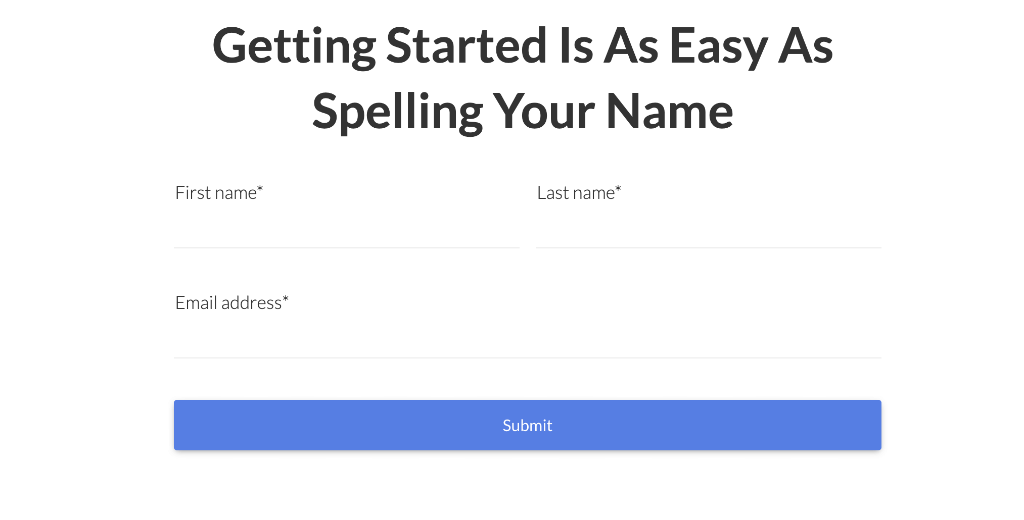
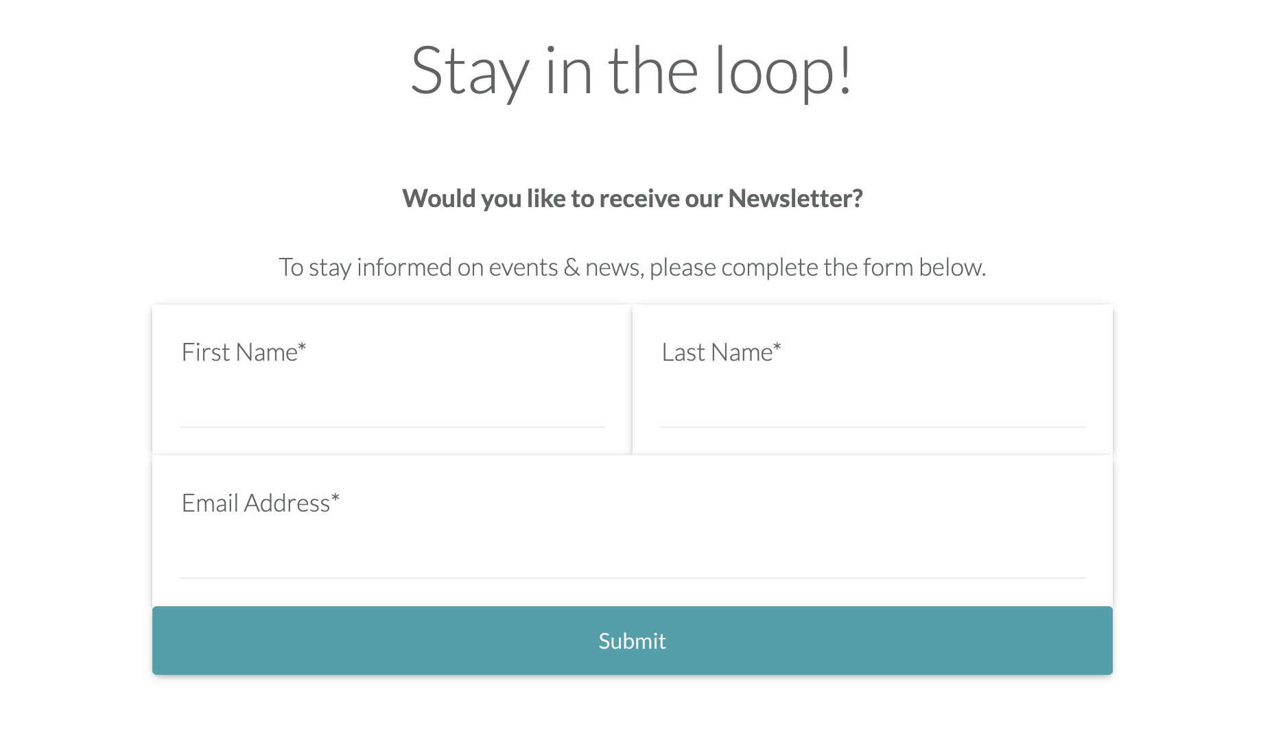 The above is a great example of a simple newsletter sign up form. The fields are minimal and only contain the information required to get the newsletter out to the prospect. The ease of this form will result in a high amount of conversions.
It is also interesting to consider the language used in this form: it is colloquial and friendly whilst not invasive or pushy. The form also indicates what will happen if a customer decides to sign up, which takes away a lot of the guesswork and will often build trust between company and respondent.
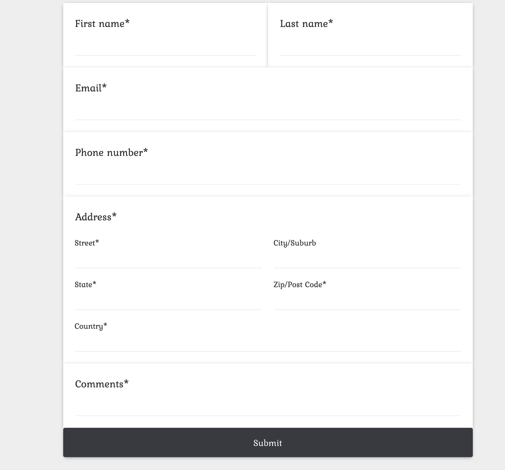
This form highlights how it is possible to ask for more information from prospects, without deterring them. The flow is simple and sensible, starting with basic information, such as name, and leading into more personal information, like address.
For SaaS businesses hoping to acquire more detailed information from their customers, it is recommended that autofill is enabled so as soon as a prospect begins typing, their device automatically fills in the required information. This makes forms with more fields easier to fill out.
Whilst all of the fields in the form above are mandatory, one way of making a form less intimidating is by giving optional fields. This means that the prospect is able to fill in the necessary information and give extra if they wish.
Conclusion
It’s no secret that lead generation forms are an integral part of growing a SaaS business, and in order to do this, forms need to be well designed. The good news is that if you follow a few simple guidelines, it is incredibly easy to create the perfect lead generation form.
