Content Marketing Strategies From Paystand’s 1,007% Growth
Contents
High traffic is not synonymous with high conversion rates. This is a painful truth that many content marketers learn the hard way.
Just to be clear, high traffic is not bad in itself. Except, if you own a SaaS business, what you need is a large number of users. Not just high traffic.
Paystand is living proof that you can grow your SaaS without getting too preoccupied with SEO stunts.
Check for yourself: 39,995 monthly traffic, according to SimilarWeb. Hundreds of thousands of customers. Estimated 1007% growth over the last three years.
But that’s not all. There are several reasons why you should dig Paystand. Here are a few of them:
- One of the top 10 fastest-growing private companies in Silicon Valley on the Inc. 5000 list.
- 200% year-over-year monthly payment revenue.
- 150 year-over-year enterprise customers.
Pretty damn good statistics, right?
Oh, did I mention their recent $20M Series B funding? Well, we can all agree that VCs bet fearlessly on the company’s future.
It took Paystand seven years to get where they’re at now. But unlike most SaaS companies, at the very beginning, they did not rush to build a team of sales pros. Instead, they have spent years and years experimenting, serving their clients, and creating solutions that work.
Now that Paystand is (almost) at the top of its game, I decided to show you they used content marketing to grow and share some .
Tip 1: Be Consistent
When you ask SEO Ninjas about the secret of SEO, they like to give you 2 cents tips:
- Answer questions on Quora.
- Stuff your blog with keywords.
- Send 1000s of emails to get two backlinks from rogue sites with DA 17.
- Or, of course, recruit them and pay them $10,000 per month.
But in fact, the secret of SEO lies in CONSISTENCY.
Yes, you heard it. The number one SEO secret is to keep on posting great content.
Just like Paystand.

Paystand’s blog is operational since 2013. And it’s only in 2020 that they managed to have their first article on Google’s first page.
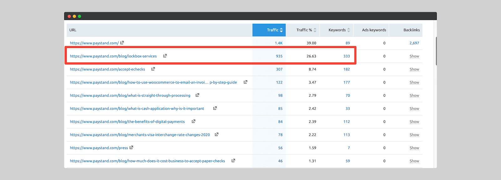
The blog post in question drives nearly 1000 visitors per month and ranks for a trifle of 334 keywords.
Just in case you’re wondering, the article is only 1,602 words long. Not 10,000 words. Only 1,602.

The key to this article’s success?
- Not the number of words.
- Not the number of keywords used.
You just have to compare articles that deal with the same subject, to realize that the best SEO tips is to write good content.
You got it, what makes this piece rank is the quality of the content.
Takeaway: SEO is a long-term game, you should not expect to reap its benefits immediately. Be consistent in the way you blog and produce quality content. Produce something that people want to read.
Tip 2: Adopt a Customer-Centric Approach
It is impossible for any company to be customer-centric if their culture does not allow it.
In their early days, companies are usually product-oriented or even sales-oriented. Very few companies focus on customers at the beginning of their business.
The fact is: to have a great product that your customers like, you have to listen to them. And that starts with building a customer-centric company culture.
Unlike many companies, Paystand has listened to its customers from the beginning and did not wait until having 500,000 customers before paying attention to what customers want.
Look at Paystand’s products over time and compare before and after. Then you’ll notice the drastic change.
Here is an overview of Paystand’s approach to see what works (or doesn’t) with their clients.
1. A/b test pricing option
Many are the marketers out there who extremely advise against A/B testing pricing.
To be honest, they are right! Pricing is hard to get right. If it is manipulated in the wrong way, it can cost your business customers or even lead the company to bankruptcy.
Remember the J.C. Penney saga?
The shorter version of the story is that their then CEO, Ron Johnson, wanted to play with their consumers’ psychology by changing pricing.
J.C Penney’s old pricing worked well with retailers because it encouraged shoppers to convince others to buy. This pricing model was so good that it created an unprecedented buzz machine. Suddenly, Ron Johnson decided to reshape this pricing strategy–mirroring Apple’s strategy. The company changed the floor merchandise, eliminated coupon discounts, and added boutiques/streets.
It was a big mistake. Because, of course, retail stores and Apple stores are different.
Apple customers know what they want, and they are willing to pay for it. They don’t need conventional sales promos to be lured to the stores. Plus, Ron made it hard for their customers to buy–which is one of the biggest pricing mistakes brands do, according to Kyle Poyar, VP of Growth at OpenView.
The end result is that J.C. Penney’s sales dropped drastically, and Ron Johnson was ousted.
Setting a price isn’t about mimicking your competitors. Paystand understood this very early on. They started by readjusting their pricing based on what they thought was convenient for their customers and aligned with Paystand’s goals.
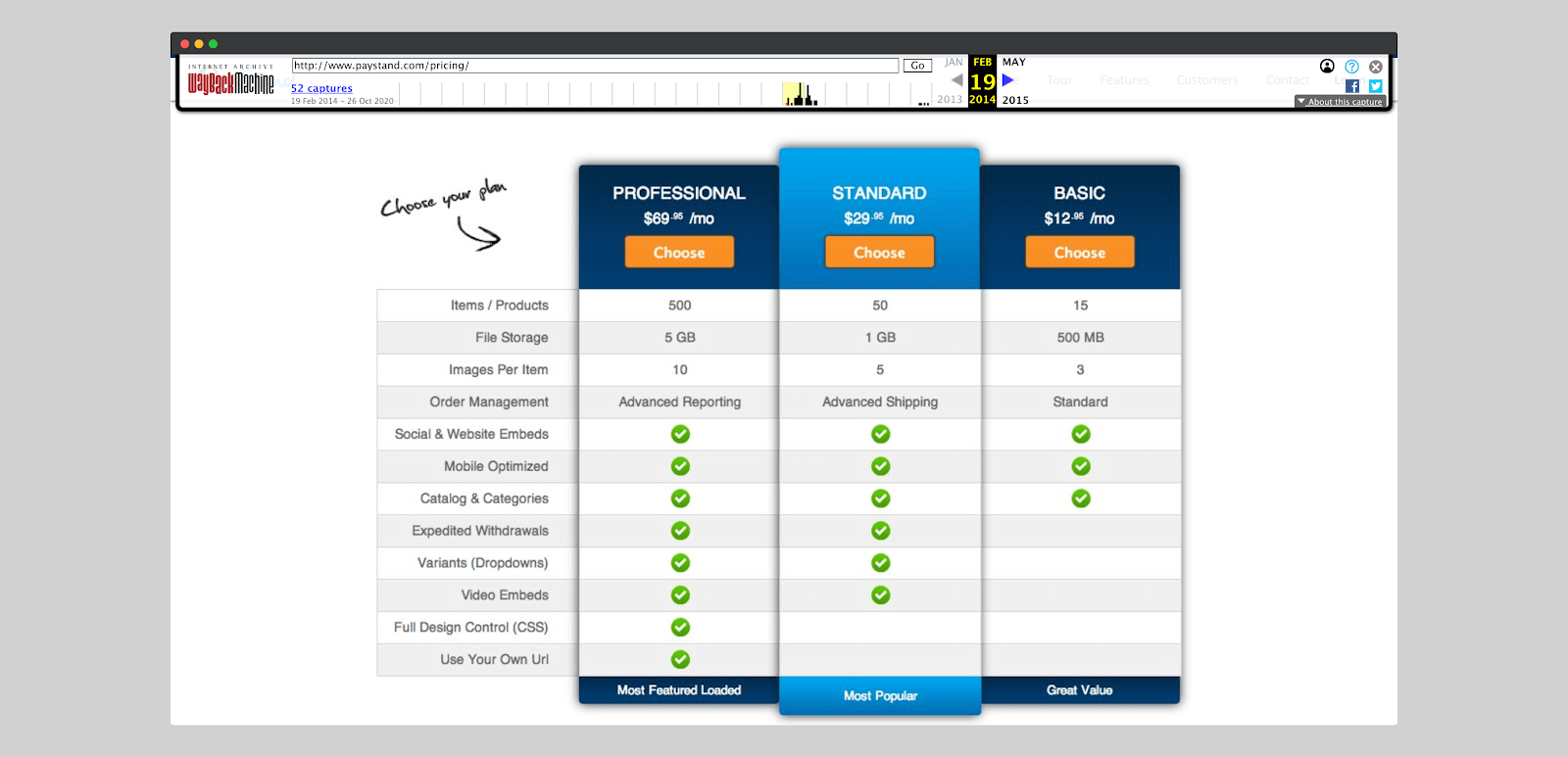
First, they tried the (Low, Medium, High) pricing, which is more of a classic packaging model.
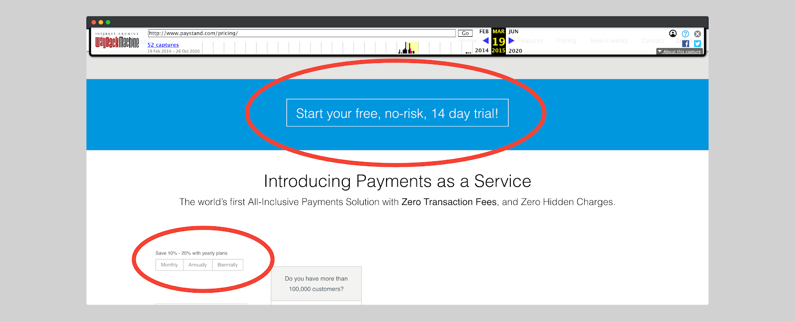
Then they continued with the same model but this time allowing a 14-day free trial. This is the model that the vast majority of SaaS companies use nowadays.
At the time of writing this article, Paystand’s pricing is not the same. Paystand doesn’t display its pricing anymore. They do, however, have a landing page that highlights the advantages of their products. And if the prospect feels interested, they can ask for a demo.
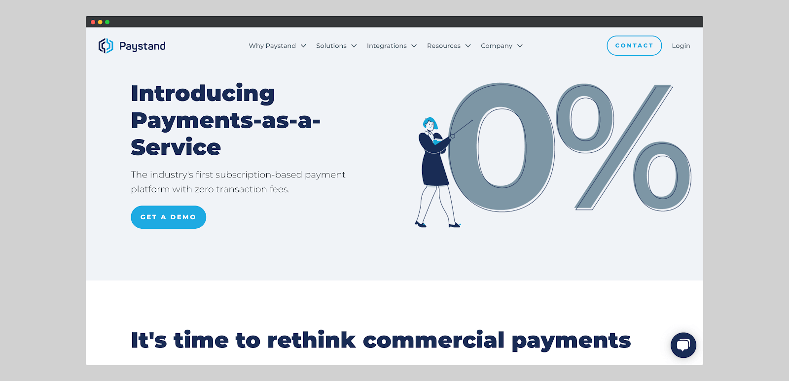
Whether you’re a large or small business, here are some tips on how to get your pricing right–much like PayStand.
1. Understand what motivates your customers.
It helps you understand why they’re paying $$$ to use your product. More importantly, you also learn what aspect of your product to play on when you decide to readjust your prices.
2. Experiment with your pricing strategy.
Your business value fluctuates over time and you can’t stick to the same old pricing package. You have to A/B test. There is no point in being afraid to change your prices. You can operate pricing changes but try not to do it the way J.C. Penney did. Try different models and stick with what works best.
3. Communicate your pricing changes.
It’s just impossible and suicidal to change your pricing overnight without conditioning your customers. Make sure you involve your customers in the process. Prepare them to be ready to accept the changes.
If you want to learn more on how to get your SaaS pricing right, check out this presentation by Kyle Poyar. He talks about the top 5 mistakes companies make when pricing their software.
2. Be where your audience is
Paystand joined social media platforms before Gary Vee started evangelizing them. The advantage of being on social media earlier is that you can already start building your audience and establish yourself as an authority before the industry becomes overcrowded.
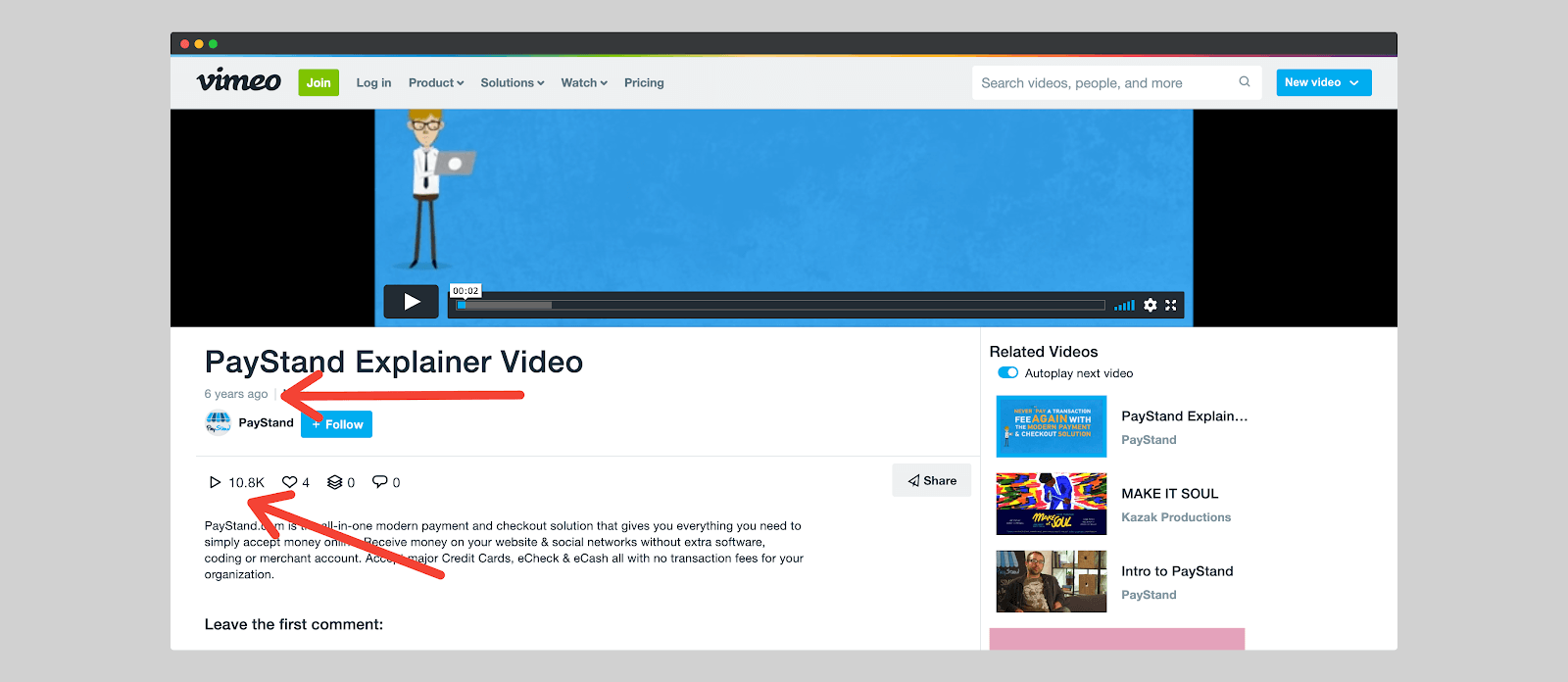
In the first years of their creation, Paystand was on Twitter following potential customers and almost everyone.
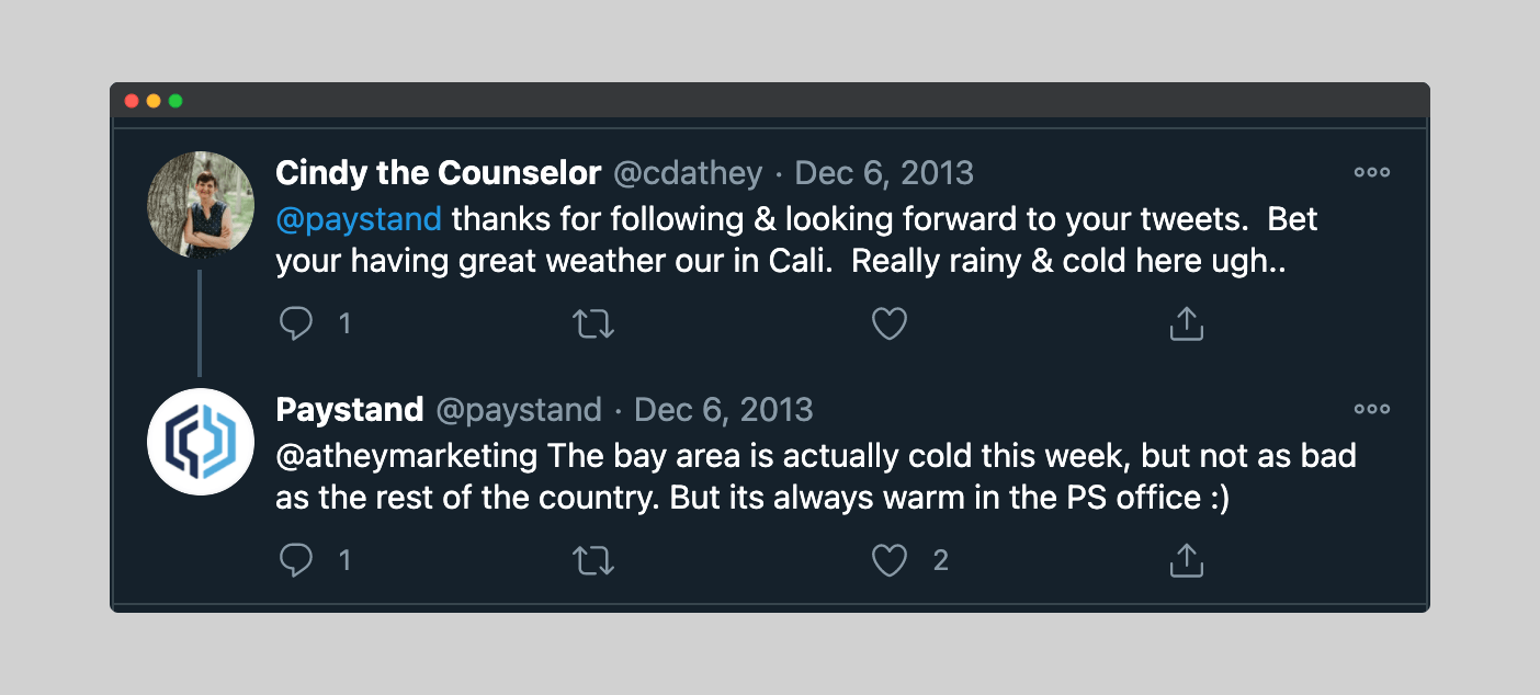
They were also using Twitter as a medium to respond to customers’ concerns.
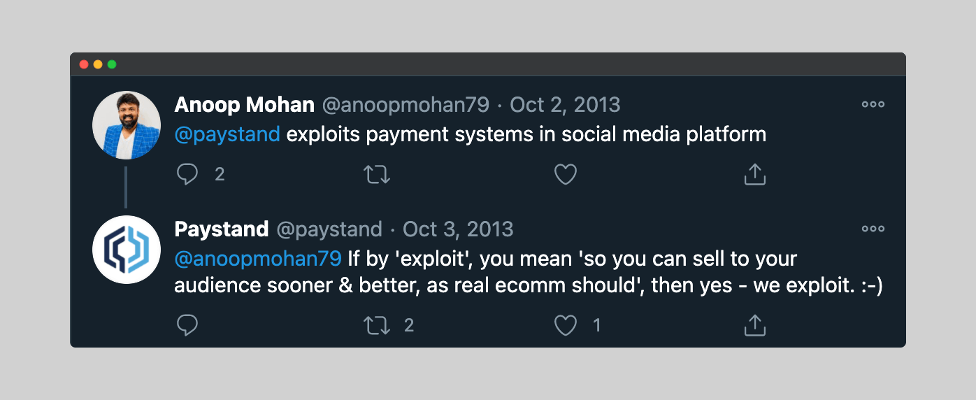
Paystand was also on social media to steal their competitors’ unhappy customers. Brands like Nike and Coca-Cola use this strategy more often.
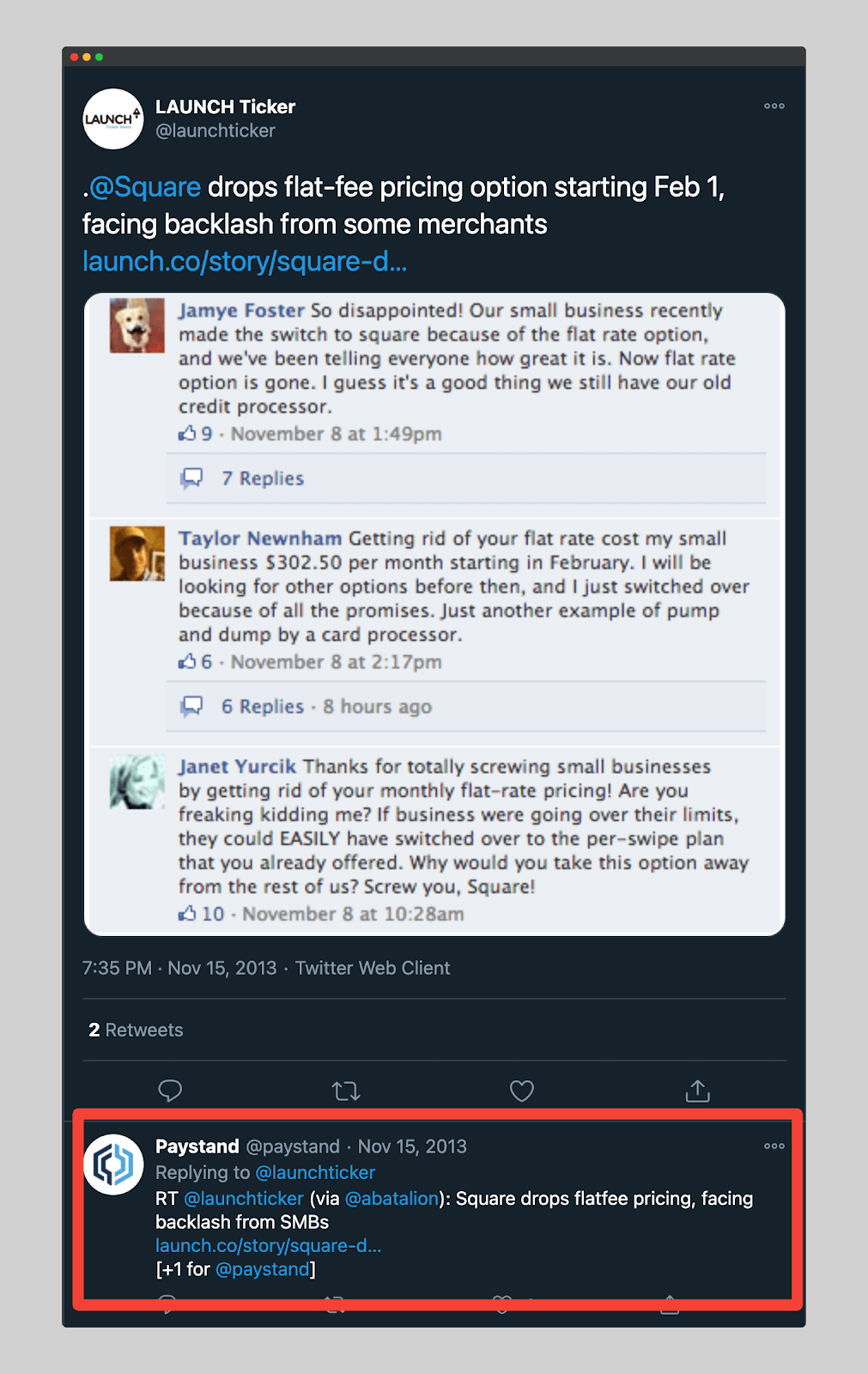
Takeaway: Don’t rush to make changes that your customers will not approve of. You should involve your customers in every single change you’re making. Be where your customer base is and listen to them. That will help you know what changes are welcome and which are not.
Tip 3: Use The Word-of-Mouth Strategy To Your Advantage
Word of mouth is the best marketing channel. We can argue this for hours, and my opinion will remain the same.
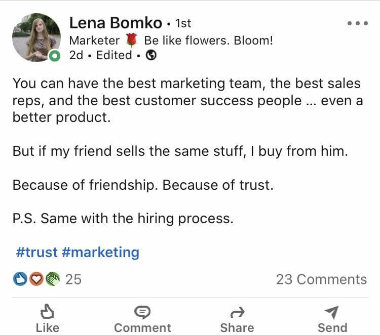
Nielsen and Ogilvy will say the same. In one of their studies, Nielsen discovered that 92% of consumers trust their relatives’ recommendations.
Ogilvy also revealed in a study that 74% of consumers recognize that word of mouth is a determining factor in their purchase.
Since their first product launch, Paystand has created a lot of buzz by using two marketing techniques that accelerate word-of-mouth.
1. Create virality via brand partnerships
When you start a new business, and your brand is not at its peak, the best way to get yourself in front of the crowd is to befriend or impress people/companies.
This method guarantees you to:
- Have the attention of a broader audience.
- Get free advertising.
The result of this strategy may differ depending on how you go about it. If you do well, you will get many customers via word-of-mouth. If you go about it the wrong way, you’re screwed.
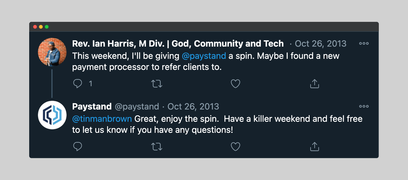
Paystand took advantage of brand partnerships from the beginning. They showed up for both virtual product launches and physical events.
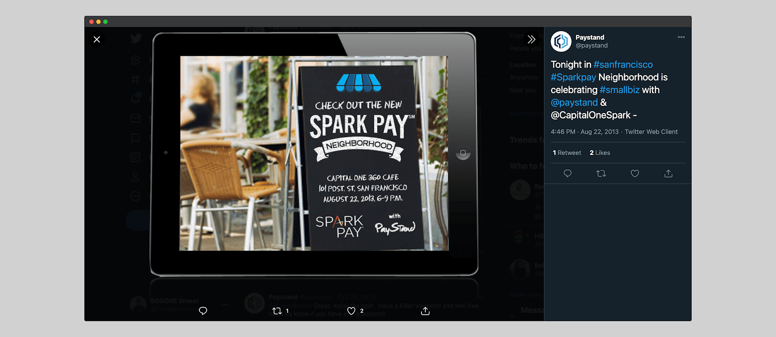
Brand partnership is a two-way street. Every party brings something to the table. As such, Paystand would advertise for their partners.
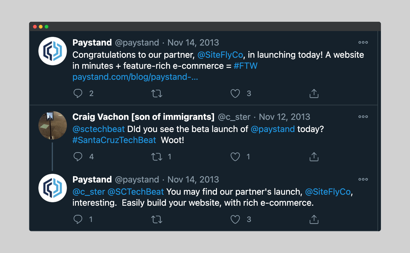
There are two factors to consider when you want to do a brand partnership:
1. Does the other brand align with your values?
If you promote women in your company, you might not want to partner with a company whose CEO is famous for his inappropriate comments about women. Doing that will make your investors and customers angry–which is bad for your business.
2. Is your brand partner’s audience appropriate for your product?
There is no reason for you to partner with a company that sells peanuts if your company sells tires. However, if you sell socks, an ideal brand partner may be a shoe company. Make sure your brand partners’ audience fits into your ideal persona.
2. Launch a private beta to create scarcity
Beta testing is just as good for marketing as it is for product development. By creating a private beta community, many brands have been able to 10x their product users.
Here is how beta testing has helped Paystand boost user acquisition:
1. Using private beta to create a sense of exclusivity
When the company launched its products, it was invitation-only–with a wait-list of interested users keen to try the products.
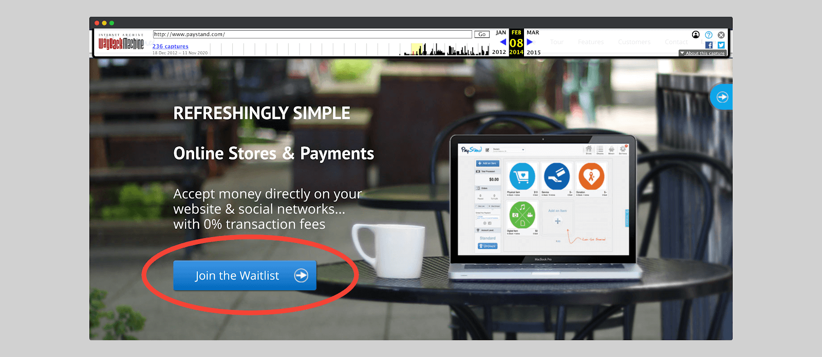
This marketing technique implicitly increases product demand. Humans like to feel special. And that’s what beta testing does: make your customers feel like VIPs. Just like Clubhouse is doing right now.
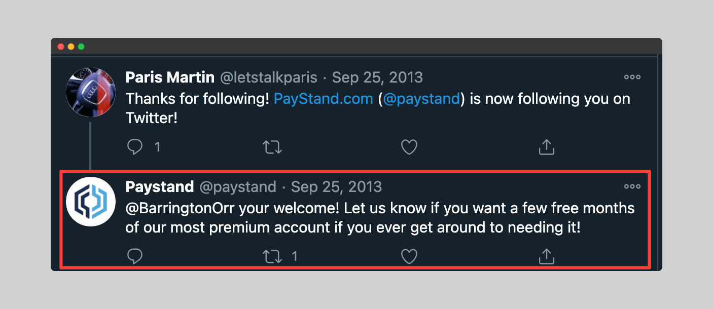
Sometimes Paystand would personally invite customers to exclusively participate in their beta testing. This only made their product more “envied.”
Supreme Sportswear also is a great example to follow if you want to boost your company’s sales using scarcity.
2. Using private beta to A/B test
Paystand took advantage of beta tests and improved the customer experience. That allowed them to avoid making mistakes during actual product launches.
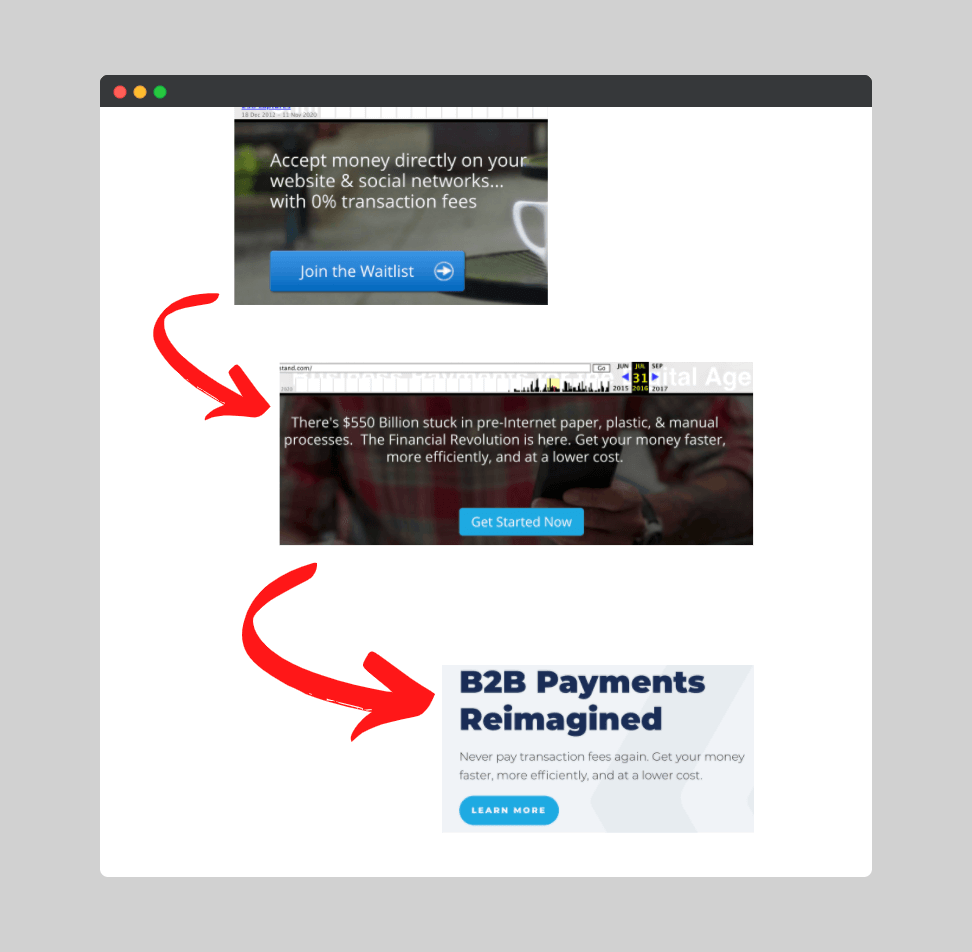
They were able to test their CTAs, interface design, and messaging–while paying attention to customers’ preferences.
See how Paystand’s CTA went from “Join the Waitlist” to “Get Started Now” to “Learn More.”
3. Using private beta to gain loyal audience
A satisfied beta tester is a lifetime customer. There is no data to back this up, but I would stay loyal to a brand that made me happy.
Paystand gained a handful of loyal users from its private beta and those were instrumental in teaching the company what product works and what does not. This allowed Paystand to revise its offering and offer products that people actually want.
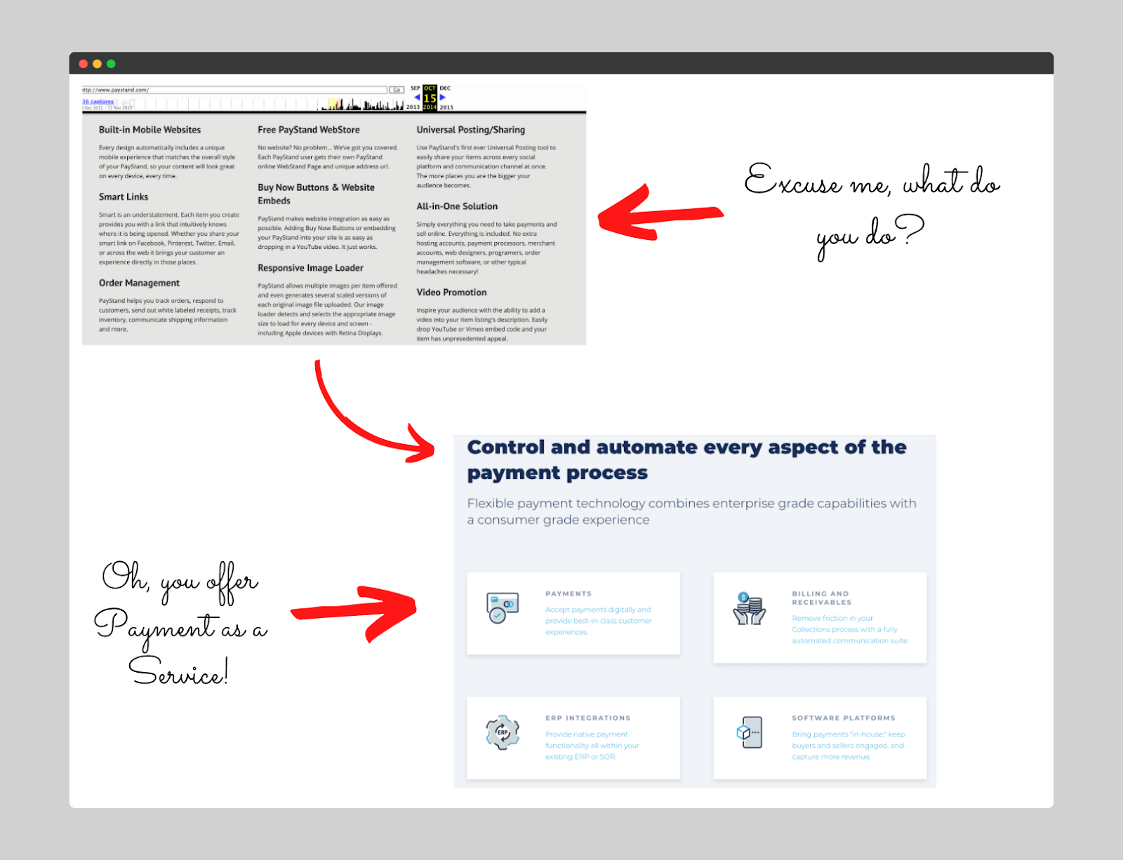
Take a look at how Paystand went from “I do everything” to “I just do one thing, and I excel at it.”
Takeaway: Are you ready to use beta testing to give your marketing a powerful boost? Here’s a handful of tips to get you started today:
- Make your product look like it’s only for certain people. Make your product users feel notorious.
- Start looking for influential voices who might be interested in testing your product. Put your fear and ego aside and ask them to share the product with their audience.
Tip 4: Boost Conversion By Doubling Down On Your Landing Page
Paystand has a lot of landing pages. Although each page is intended for different products, the copy still has the same structure. And the focus is on the website’s homepage.
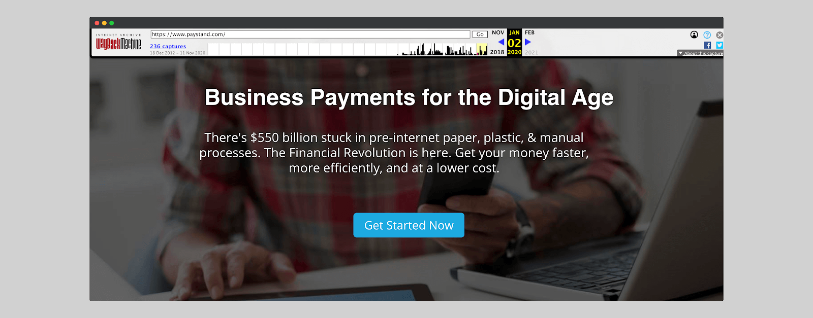
The homepage (until January 2020) looked like this:
But in 2020, it went through a redesign and even the messaging changed.
Why did they choose to do this?
“Simply because we have evolved. And also because we now have the luxury. In the early years, we focused on developing technologies and products to open up a new commercial finance era. The brand had to wait,” Mark Fisher, Vice President of Marketing at Paystand.
Here is how the rebranding went :
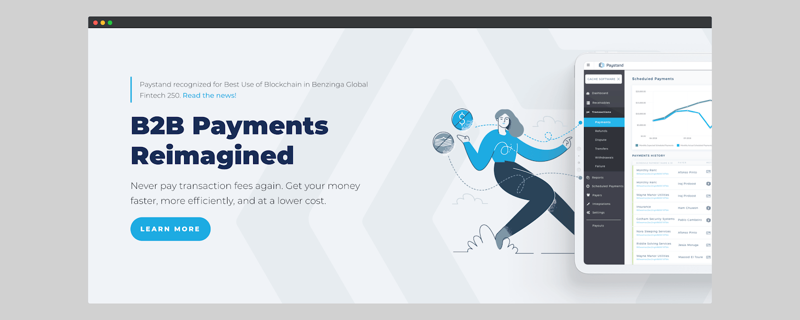
As you can see, the homepage is not full of sales-y words. The copy is concise and clear. Of course, if the visitor is looking for additional information, they can scroll down the page. This strategy helps shed light on just one thing: the CTA. That also keeps visitors less distracted.
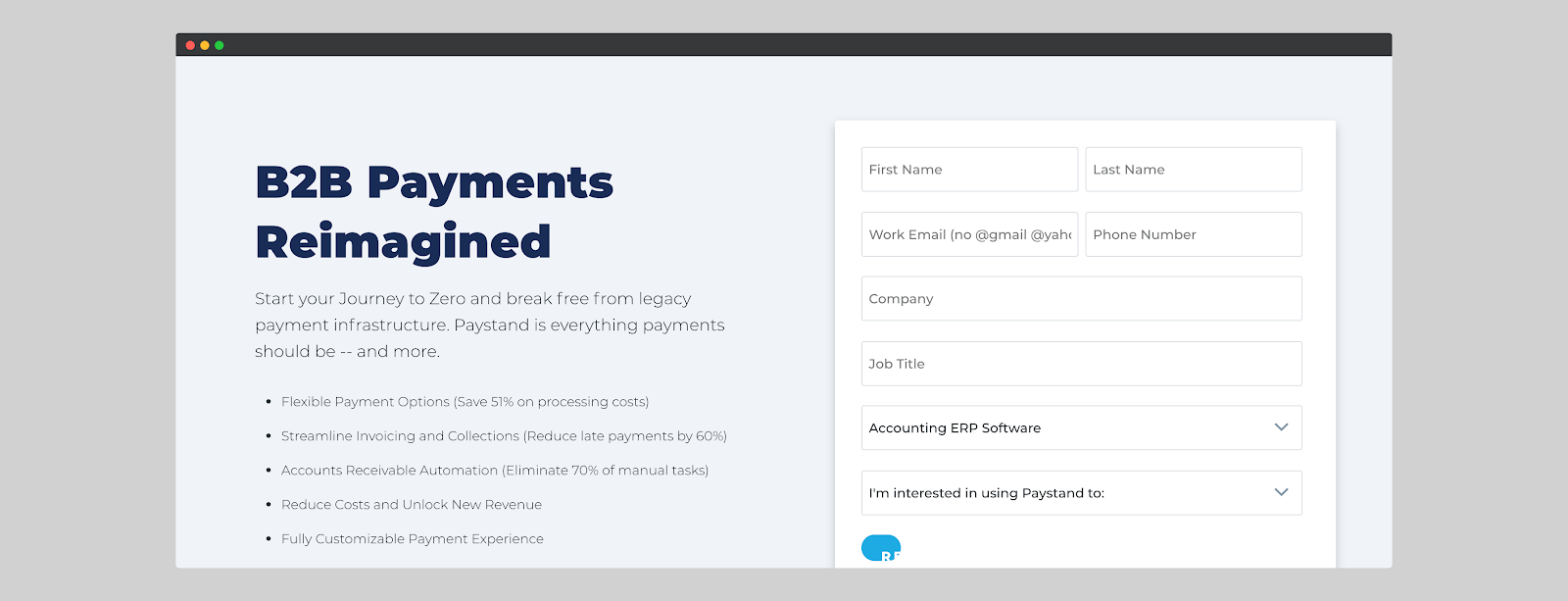
There has been a noticeable change in CTA buttons on the homepage over time. This made me realize that they’re continually performing A/B tests on the above-the-fold section of their homepage to see what works best:
Test A: “Get Demo” button, then email subscription field (two-step opt-in)
Test B: “Learn more” button, which also leads to an opt-in email address field (opt-in in 2 steps)
One of the significant changes that can also be seen on the home page is that they have doubled down on the social proof and testimonials section. And it makes them more credible in the eyes of prospects.

Let’s break down the page so you can reverse-engineer it if needed.
Here’s what the home page looks like above the fold:
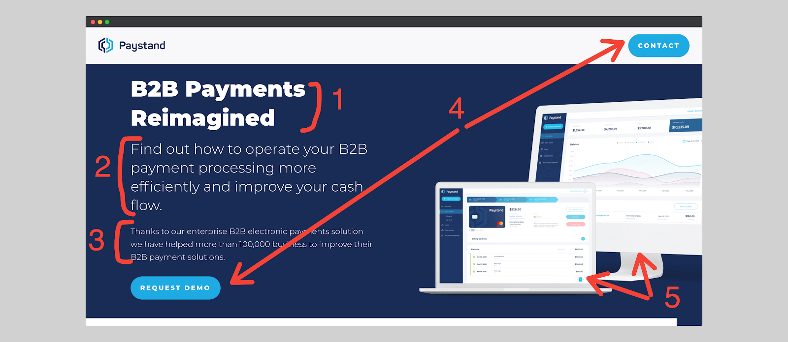
- Three words that are well highlighted to draw the visitor’s attention. These words give the reader the bug in the ear about what Paystand does.
- A straightforward and concise description of what you can do using Paystand. B2B payment is still a pain on the backside of companies. Paystand allows, thanks to its solutions, to overcome this problem before it ruins your business.
- This sentence explains what Paystand has already accomplished with its past customers. The importance of this section is to sound credible. Many companies claim to be able to do things they have never done. Paystand wants to be different. The number “100,000” emphasizes how many companies have already used Paystand successfully. Not 2. Not 10. One hundred thousand companies. Enough for you to decide to jump into the deal.
- Two CTAs on the same “above the fold” page. The advantage of putting your CTA in this specific section of the website is that it increases conversions. In a study called “The Importance of Being Seen,” Google found that buttons above the fold had a 73 percent rate of visibility to users. In comparison, those below the fold had visibility of only 44 percent.
Paystand relied on two CTAs to increase conversion rate. You might be thinking, “this is confusing.” Actually, it’s not. First of all, both CTAs lead to the same page: the opt-in email address page.
Also, having two CTAs on the same page allows you to test which button gets the most clicks. This method is used by several brands such as Moz, Flickr, Asana, and many others.
5. An illustration showing what the Paystand tool interface looks like. It is a kind of preview of the product. Most accounting software are similar to Excel or Google Spreadsheet. And you know how complex it is to manage spreadsheets.
Through the image, Paystand shows how user-friendly and colorful is the interface. This encourages the visitor to be more interested in the product.

6. Before revamping their homepage, Paystand only displayed media that featured them. In terms of social proof, it’s a good start, but it’s no longer a secret that anyone can hire PR agencies and get featured in publications.
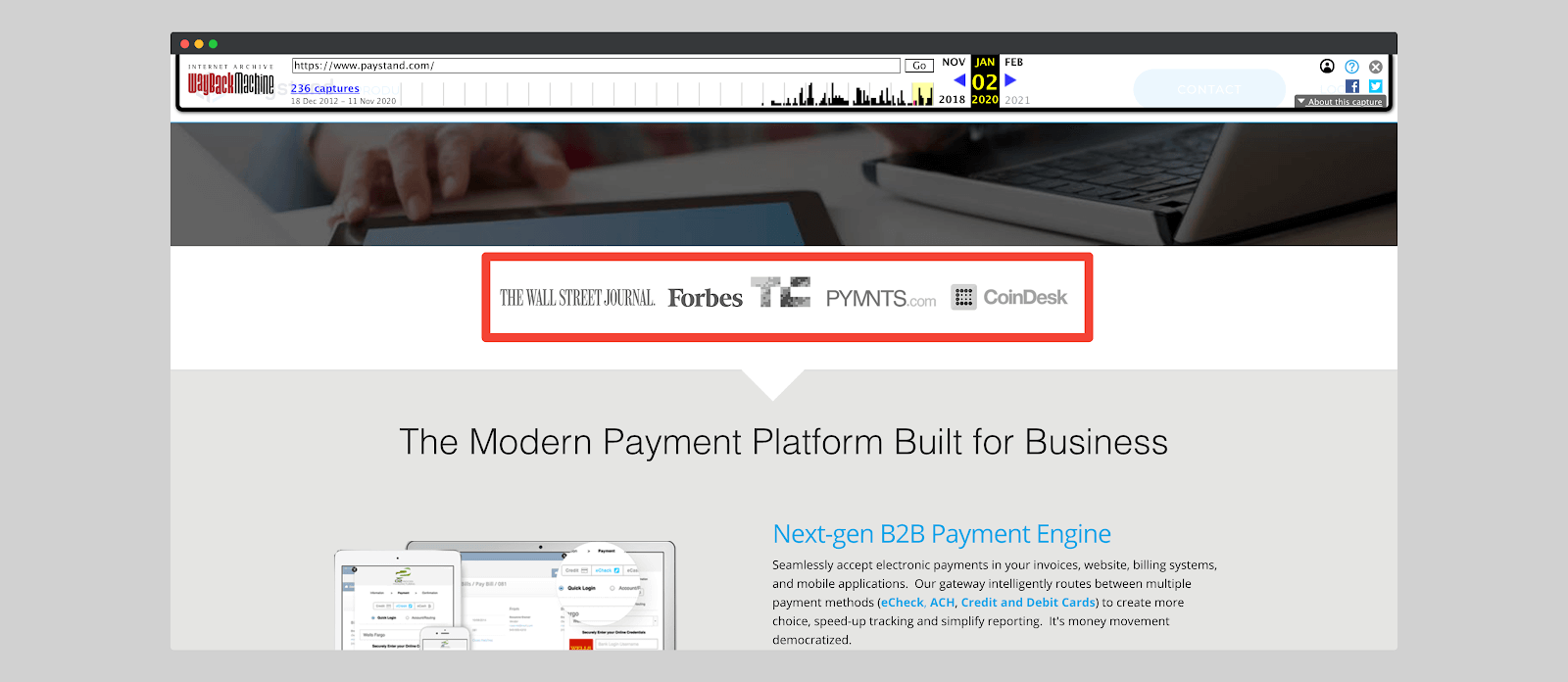
Also, just because TechCrunch tossed flowers on your product doesn’t mean it as useful and practical.
If you want to pilot my jet, show me you’ve flown aircraft in the past.
That’s what Paystand does by showing a list of clients for whom their software has worked wonders. This gives the prospect the confidence that their investment is safe.
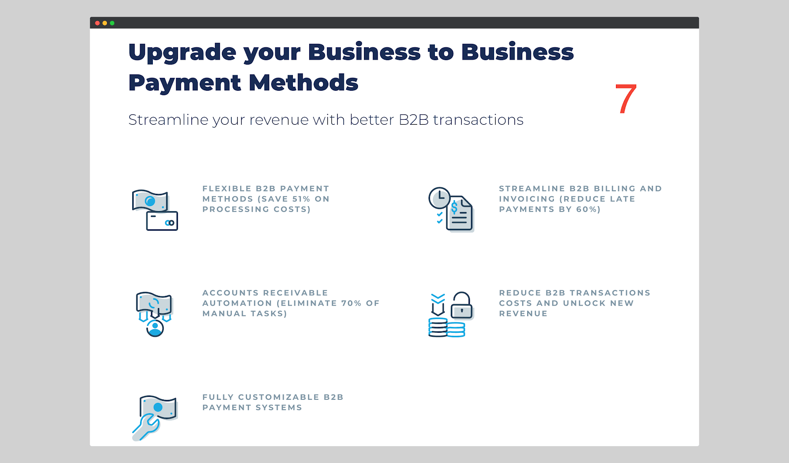
7. This section explains in more details the advantages of using Paystand’s solutions. It is also, in a way, what the company does (or can help a company do).
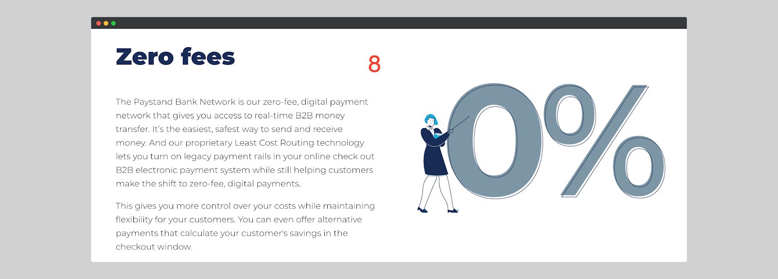
8. This part is mixed. On the one hand, it talks about the advantages of using Paystand. On the other hand, it highlights the features of Paystand.
The advantage is that Paystand “helps send and receive money in the fastest and easiest way possible.” Companies can take advantage of this benefit thanks to the “Paystand Bank Network” feature.
This copy formula allows Paystand to combine two persuasive factors (benefits + features) in one section while focusing on clarity and simplicity.
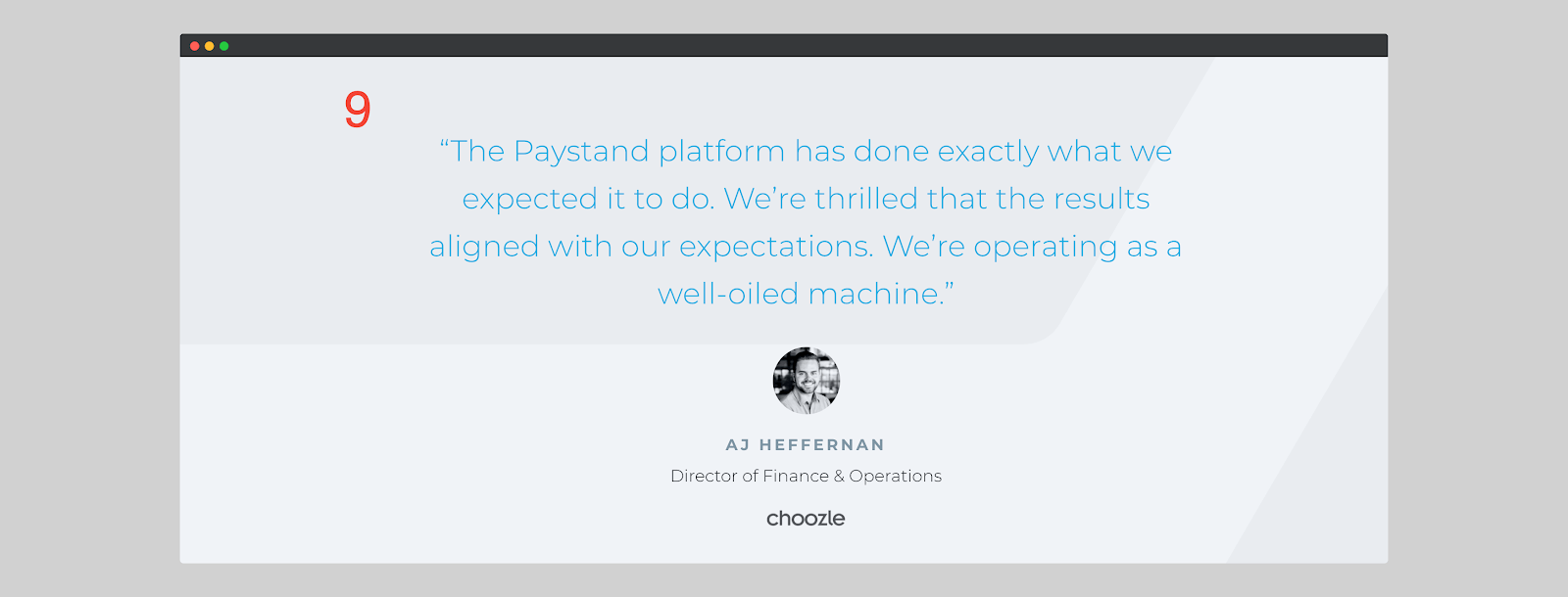
9. A Strategic Factory study revealed that using customer testimonials regularly can generate approximately 62% more revenue.
In the previous version of its website, Paystand had not put any testimonials. It is only after the revamping that they started putting one per landing page.

10. The landing page’s primary CTA. By highlighting the possibility for companies to overcome their payment issues, Paystand gives prospects a reason to give them a shot.
Have you noticed that nowhere on the page was the pricing mentioned?
Well, that’s because Paystand doesn’t want to give the impression that they are desperately selling. This method makes the prospect feel more comfortable and confident with the brand.
Tip 5: Use Conversational Marketing To Generate More Leads
The average landing page conversion rate is only 2.35%.
Dramatic, isn’t it?
The reason is that consumers no longer have the patience to get stuck in a funnel that is cold, impersonal, and sales-y.
Also, marketing has become overly dull and formal. Threaded emails that respect no personalization rules–making prospects bored. Or think about the 17,500-word sale pages that don’t address the buyer’s concerns.
RELATED ARTICLE: The Ultimate Guide to Email Marketing
Conversational marketing allows you to build relationships and create authentic experiences with your customers and buyers.
How?
Through instant messaging. Think about it: people love chatting because it’s fast and doesn’t make you wait hours for a response.
In a study, Twilio revealed that 90% of consumers want to use instant messaging instead of email to communicate with businesses. Think about why LinkedIn, Slack, and Microsoft Teams have become so popular.
Paystand decided to use a chatbot to answer questions from buyers promptly without wasting their time.
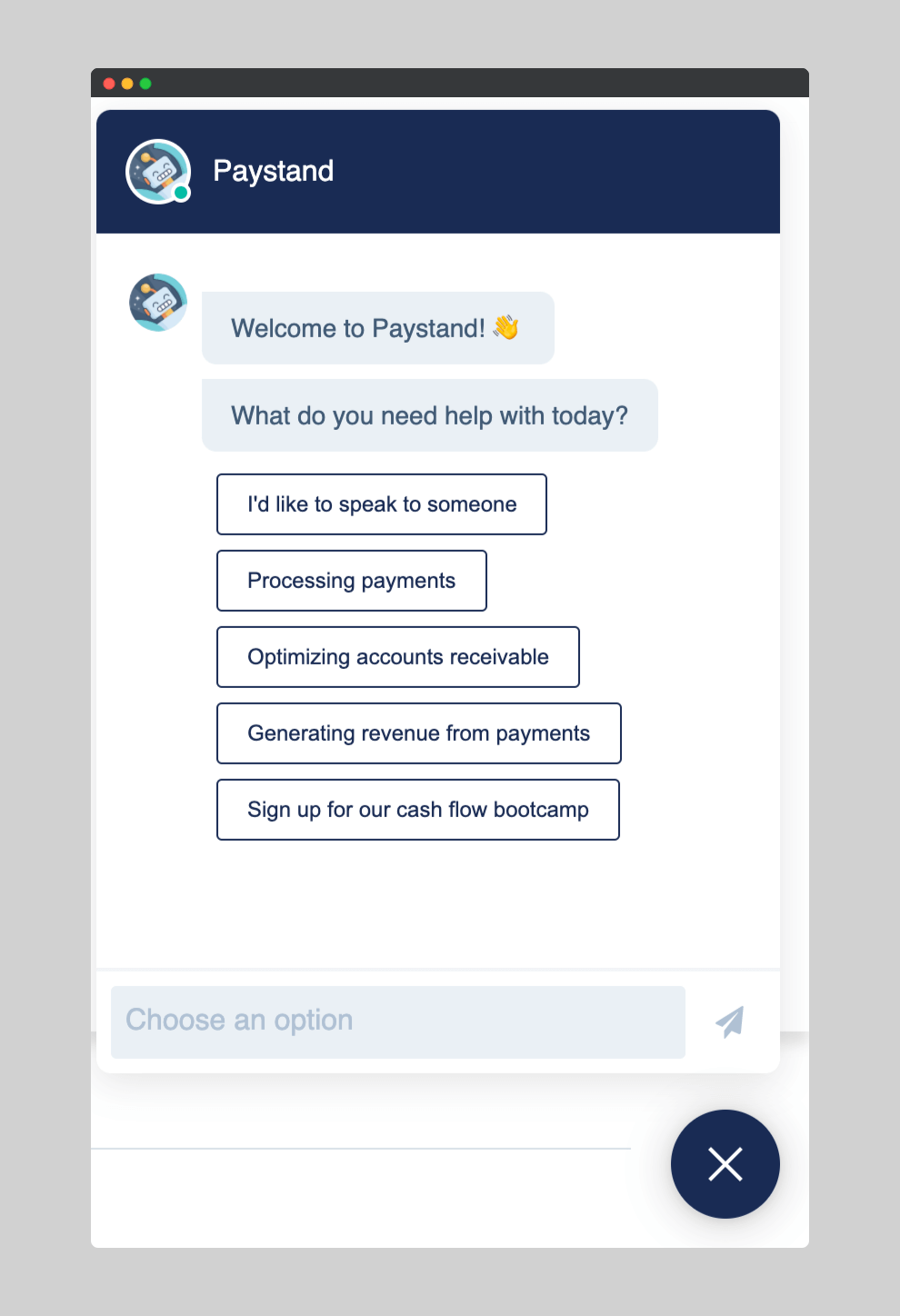
Contrary to popular belief, you can configure a chatbot to send non-robotic messages. Here is how:
1. Define the chatbot’s purpose.
If you want to make your chatbot more conversational, the first step will be to define its primary objective.
Is it a bot for sending jokes? Sending reminders to users? Or informing visitors?
Here is a list of what the Paystand chatbot is for:
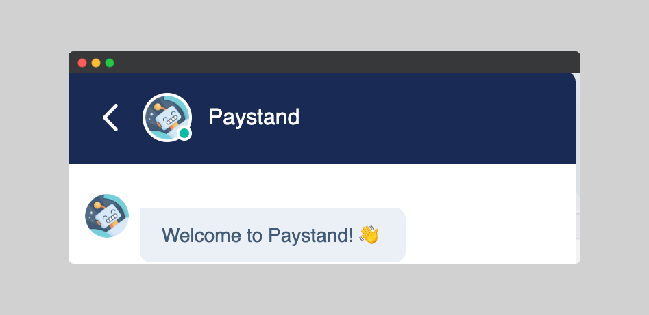
- Welcoming visitors to the website.
- Helping visitors schedule an appointment with a staff person.
- Registering people for their events (Bootcamps, Webinars, etc.).
- Telling people more about Paystand’s services and products.
2. Give your chatbot a persona
Your chatbot needs to have a persona. Otherwise, it will face problems communicating with your audience.
Defining a persona gives authenticity, tone and style, and personality to your chatbot. It also allows you to define writing style, maturity, and politeness.
Think of it as a task where they asked you to write a story about an alien. Obviously, you can’t write anything accurate because “Alien” is vague. So, you need more details to write your narrative.
Now imagine being told to write a story about an alien who is 6 feet tall, has blue skin, and likes pizza. More useful, isn’t it?
Here’s a little bit about the trait of the Paystand chatbot.
- It’s professional.
- The language is serious. No slang. No emoji.
- The tone is conversational and informative.
3. Create a conversation diagram
Everyone likes text messages because they are short and to the point. They become very dull when they are long and full of unspecified information.The same applies to chatbot messaging.
That’s why you need a conversation diagram. It allows you to organize the conversation into small pieces that give structure and precision to your chatbot’s messages.
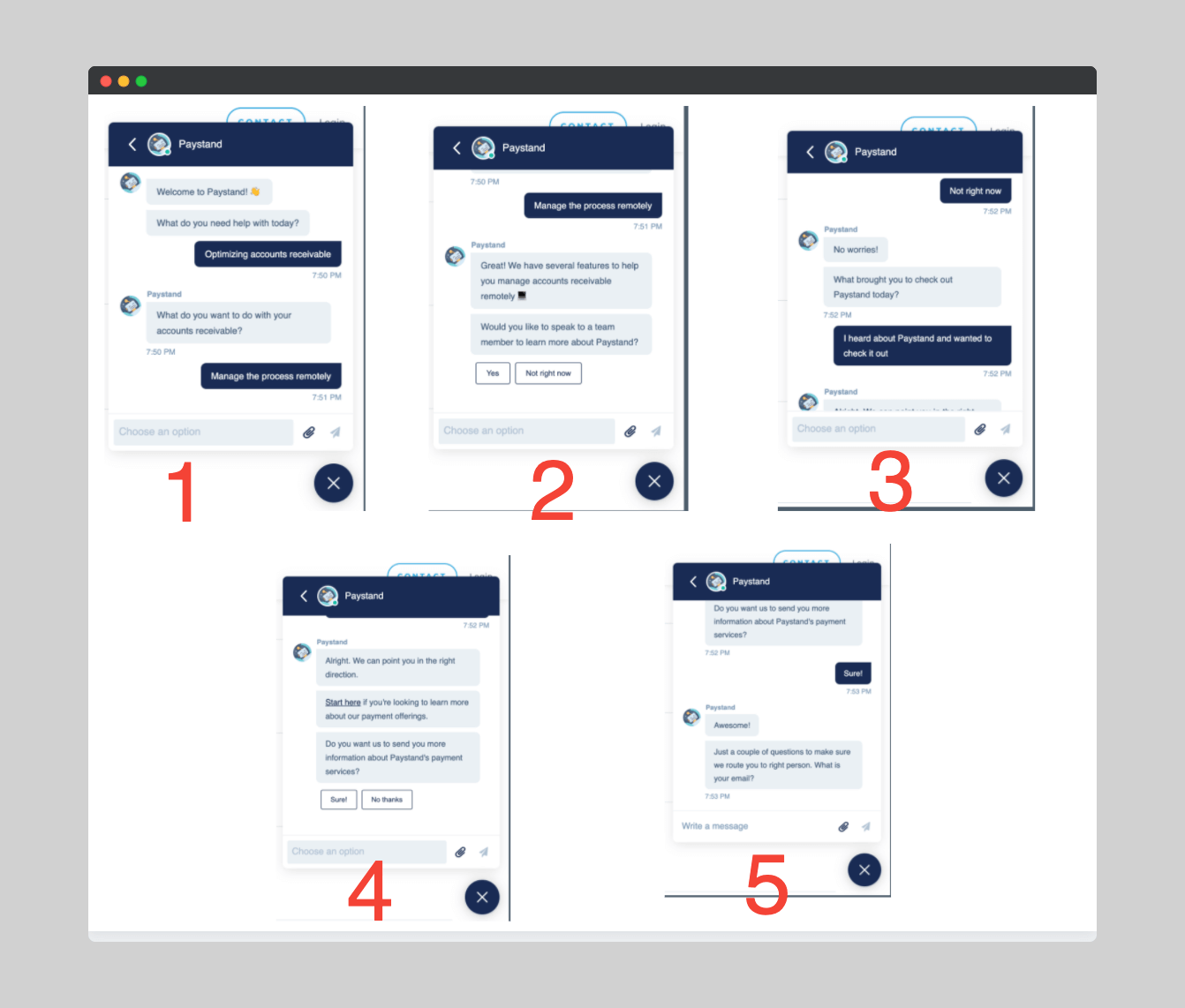
Here is a little bit of the Paystand conversation diagram:
Greeting: This is the part where the conversation begins. The formality of the greeting depends on the target audience.
Paystand targets small and medium-sized businesses, enterprises, and eCommerce businesses. So the language is a bit serious.
Asking: This allows you to establish the basis of the conversation. It will enable the chatbot to keep the discussion going.
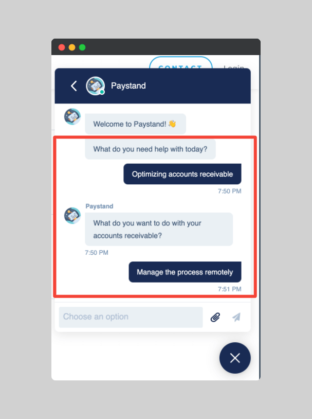
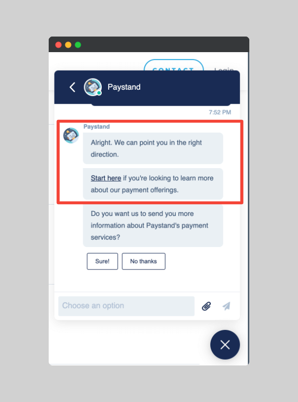
Informing: This element allows your chatbot to provide the requested information.
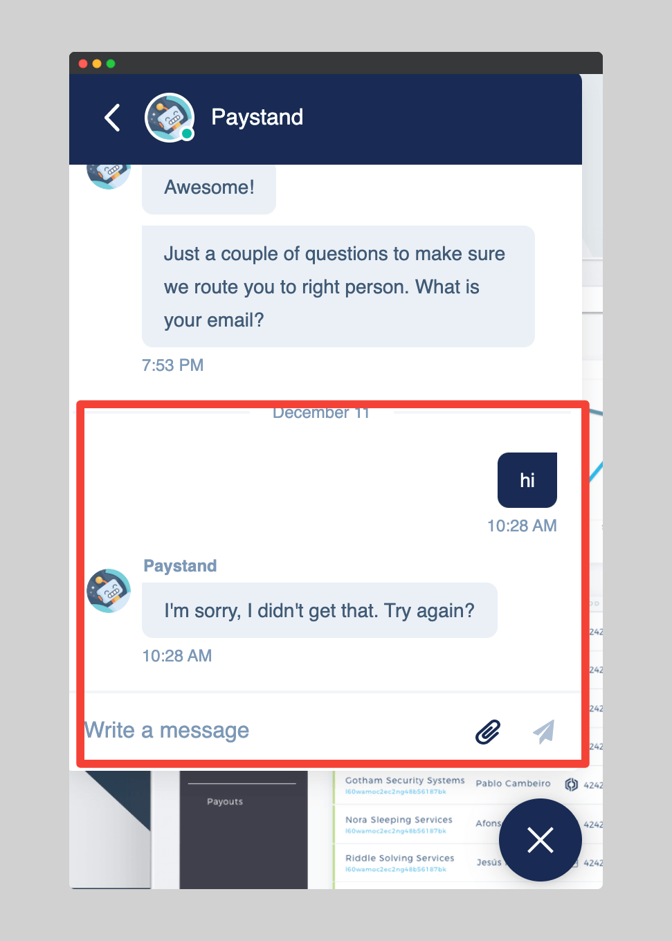
Error: This element allows you to define the chatbot’s answers when it doesn’t understand or fails to fulfill a request.
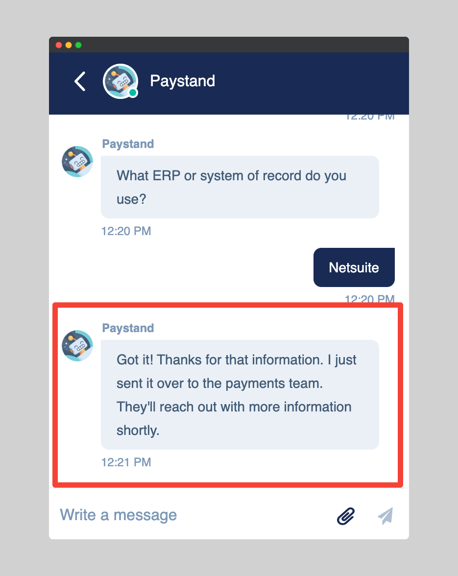
Conclusion: This element makes it possible to end the conversation.
Your conversation diagram should reflect the experience you want the user to have. Also, keep in mind that you need to create multiple diagrams for multiple conversation scenarios.
Here is an example of a conversation diagram.
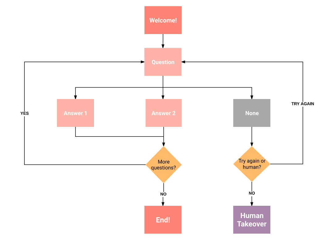
Once your diagram is ready, you can start writing the script. Then, you can test with your friends or colleagues and readjust as needed.
Takeaway: Make sure the bot’s tone and personality are aligned with your brand’s voice and target audience. Also use the bot to address FAQs, product updates, etc. This way, your sales team can focus on doing more important tasks.
8 Things to Keep In Mind
- SEO is, first and foremost, about producing good content and being consistent. By producing something that people want to read, you’ll transform your company’s website into the go-to resource for players in your industry.
- The best way to beat your competitors is to listen to your customers and address their pain points. Paystand does this by being present in every social media their customers use. For instance, the company doubles down on Twitter because that is where their target audience is.
- Do not make any price changes unless you are sure your customers are prepared for it. Paystand took years to test its pricing options before coming up with the final formula you see on their website now.
- If you can’t afford to spend billions of dollars a year on advertising, partner with other companies instead. This is the method Paystand used to get free advertising from its partner companies.
- In the same way if you have a shoestring budget but want to go viral, adopt the private beta strategy to make your product exclusive. A bit like Paystand and Clubhouse.
- You don’t need to be salesy to increase conversion. Just like Paystand, you can improve your CTR by putting your CTA button up front, using social proof and highlighting the benefits users will get from using your product.
- Always test your website design and buttons. This allows you to know what works best. Keep in mind that it is not necessary to rebrand every month. Paystand just makes minor changes that are not obvious.
- Conversational marketing is the future. Use chatbots to nurture your leads. This way you eliminate unqualified leads– allowing your sales team to only deal with qualified leads.

